
Project Case Studies
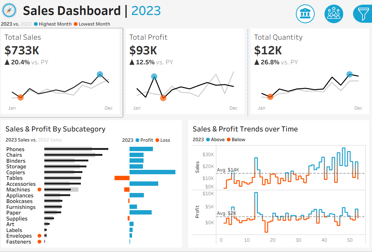
Unified Sales & Customer Analytics Dashboard
Tools Used: Tableau, SQL
Skills Demonstrated: KPI Design, Data Visualization, Customer Segmentation, Interactive Filters
Project Description: This project combines sales performance analysis and customer behavior insights into a unified Tableau dashboard. It was built using retail sales data to help stakeholders track revenue, profit, and quantity trends over time while also identifying top customers and segmenting them by value and location.
Goals
- Visualize total sales, profit, and quantity over months.
- Analyze performance by category, sub-category, and region.
- Identify top customers by profit and order count.
- Understand customer distribution across regions.
Key Features
- KPI Cards: Total Sales, Total Profit, Quantity Sold.
- Time-Series Visuals: Monthly trends for sales and profit.
- Profit & Loss Breakdown: Subcategory-wise profit/loss analysis.
- Customer Dashboard: Top 10 customers by profit, region-wise customer distribution, and order volume comparison.
- Interactive Filters: Region, Category, Sub-Category, Customer.
Outcome
- A dynamic dashboard that links sales and customer insights through interactive filters.
- Business users can easily explore who buys what, when, and where.
- Showcases your ability to build end-to-end BI dashboards combining multiple dimensions of analysis.
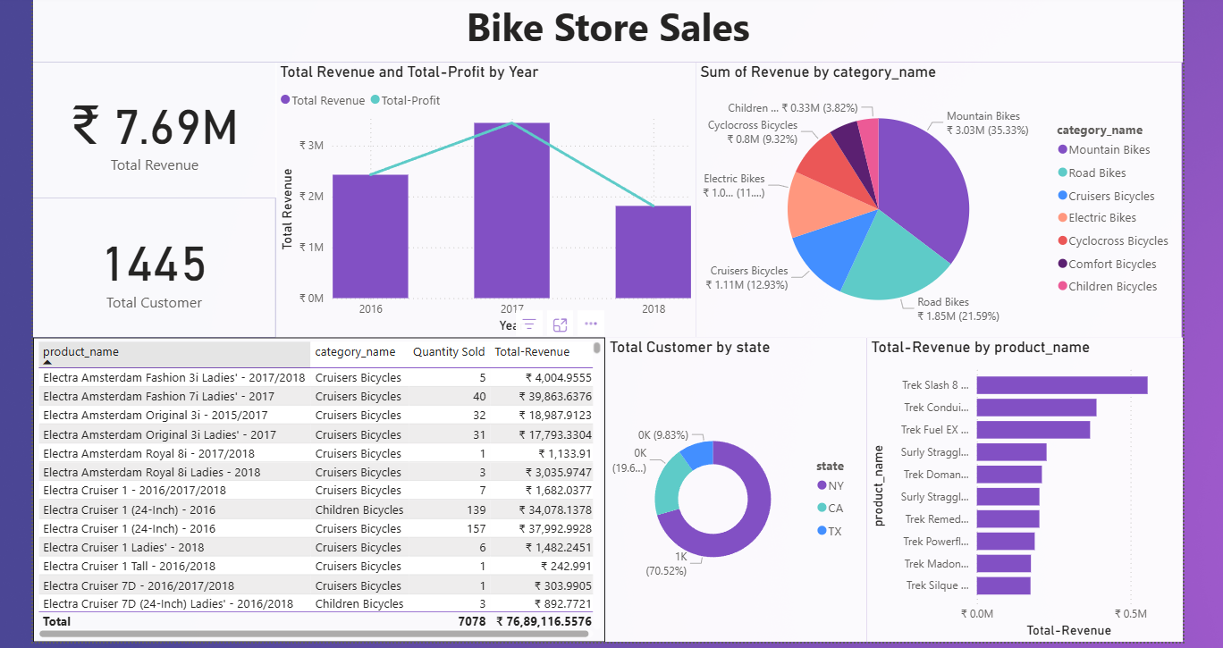
Bike Store Sales Analysis Dashboard
Tools Used: Power BI, Power Query, DAX
Skills Demonstrated: Data Modeling, KPI Calculation, Visual Design, Interactive Filtering
Project Description: This project involved building an interactive Power BI dashboard to analyze the sales performance of a bike retail business. It provided detailed insights into revenue, order volume, and product category performance across different store locations and customer types.
Goals
- Understand sales trends across product categories and regions.
- Identify high-performing products and customer segments.
- Enable business decision-makers to filter and drill down into the data easily.
Key Features
- KPIs: Total Sales, Total Orders, Revenue per Category.
- Category & Subcategory breakdown of product performance.
- Region-wise and customer-wise revenue analysis.
- Interactive visuals with slicers for: Product type, Store location, and Time period.
- DAX Measures for dynamic calculations and performance metrics.
Outcome
- Delivered a clear, business-ready dashboard for retail sales monitoring.
- Enabled users to interactively explore trends and product performance.
- Showcased your ability to connect, model, and visualize data using Power BI for retail business use cases.
Retail Sales Data Warehouse Analysis
Tools Used: SQL Server, T-SQL
Skills Demonstrated: Data Warehousing, Fact-Dimension Modeling, Advanced SQL, KPI Calculation, Performance Segmentation
Project Description: This project focused on analyzing a retail business’s sales data using a structured data warehouse model. By working with fact and dimension tables, advanced SQL queries were written to extract insights related to customer behavior, product performance, and time-based trends. The project also included the creation of reporting views to support BI dashboards.
Goals
- Perform deep-dive exploratory and performance analysis using SQL.
- Create reusable reports and views for BI consumption.
- Segment customers and products based on behavior and performance metrics.
Key Features
- Explored and joined multiple tables: fact_sales, dim_customers, dim_products.
- Calculated key metrics: Total Sales, Quantity, Orders, Customers, Revenue per Category, and Time-based Trends.
- Created customer segmentation: VIP, Regular, New.
- Product segmentation: High, Mid, Low performers.
- Built SQL Views: customer_report and report_products for BI tools.
- Applied advanced techniques: Ranking, Time analysis, Moving averages and running totals.
Outcome
- Built a complete SQL-based analytical solution replicating enterprise-grade reporting workflows.
- Proved your ability to work with dimensional models and write complex SQL for data-driven decision-making.
- Ideal project for demonstrating Data Engineering and BI SQL expertise.
Lung Cancer Risk Factor Analysis
Tools Used: Python, Pandas, Seaborn, Matplotlib, Jupyter Notebook
Skills Demonstrated: Exploratory Data Analysis (EDA), Data Cleaning, Visualization, Risk Pattern Identification
Project Description: This project aimed to explore and identify potential risk factors contributing to lung cancer using a medical dataset from Kaggle. Through extensive EDA, the project uncovered patterns related to lifestyle habits, age, gender, and chronic conditions in relation to lung cancer diagnoses.
Goals
- Investigate which features (smoking, alcohol, anxiety, etc.) are most correlated with lung cancer.
- Understand demographic trends and risk distributions.
- Present insights through clean, annotated visualizations.
Key Features
- Data cleaning: handled missing values, standardized column formats.
- Univariate analysis of features like smoking, alcohol use, age group, and gender.
- Bivariate correlation heatmaps to visualize relationships between attributes and cancer outcome.
- Distribution analysis by gender and lifestyle traits.
- Insightful visualizations: Count plots, Box plots, histograms, and heatmaps.
Outcome
- Identified strong associations between lung cancer and factors like smoking, anxiety, chronic disease, and alcohol consumption.
- Built a clear and professional EDA notebook with visual evidence and markdown interpretations.
- Demonstrated your ability to clean, explore, and analyze health data using Python.
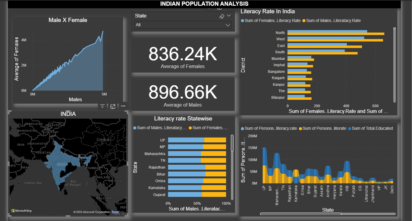
Indian Literacy Analysis Dashboard
Tools Used: Power BI, Power Query, DAX, Excel
Skills Demonstrated: Demographic Analysis, Geographic Visualization, Data Cleaning, Dynamic Reporting
Project Description: This Power BI project analyzed literacy rates across Indian states by gender and over time. The goal was to uncover disparities, track improvements, and visualize literacy patterns through interactive charts and maps, making it easier for policymakers or educators to interpret state-wise educational progress.
Goals
- Compare male and female literacy rates by state.
- Identify top and bottom performing regions in terms of literacy.
- Present findings in an interactive, geography-driven Power BI dashboard.
Key Features
- State-wise literacy map with tooltip insights.
- Gender-based comparisons using bar charts and trend lines.
- KPI cards for overall literacy, male literacy, and female literacy.
- Slicers for filtering by Year, Gender, and State/region.
- DAX measures to calculate literacy gaps and percentage changes.
Outcome
- Delivered a clean and insightful dashboard that makes it easy to identify educational disparities and literacy trends.
- Highlighted the gender gap in literacy and showcased regions with high/low literacy rates.
- Demonstrated your ability to visualize geographic and demographic data using Power BI.
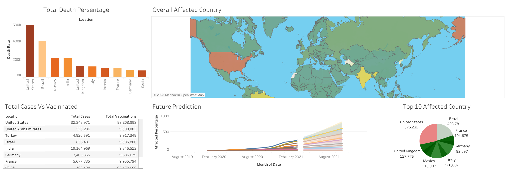
COVID-19 Global Impact Dashboard
Tools Used: SQL, Tableau, Excel
Skills Demonstrated: Time-Series Analysis, Geo Visualization, SQL Aggregation, Data Cleaning, Public Health Analytics
Project Description: This project analyzed the global impact of the COVID-19 pandemic using SQL for data preparation and Tableau for interactive visualization. The dashboard tracks confirmed cases, deaths, recoveries, and vaccination data across countries, offering visual insights into how the pandemic evolved over time.
Goals
- Monitor the spread and impact of COVID-19 by country and date.
- Compare trends across continents and time periods.
- Visualize key pandemic metrics interactively and geographically.
Key Features
- SQL used to: Clean data, aggregate metrics daily/monthly/yearly, and join multiple tables.
- Tableau dashboard visuals: Line charts, Choropleth world maps, and Country-wise ranking tables.
- Dynamic filters for: Date range, Country/continent, and Metric type.
Outcome
- Delivered a multi-page Tableau dashboard powered by SQL analysis, enabling stakeholders to monitor pandemic trends.
- Showcased your ability to handle real-world health data and present it through time-based and geo-based storytelling.
- Demonstrated strong SQL + Tableau integration, ideal for roles in BI or public health analytics.
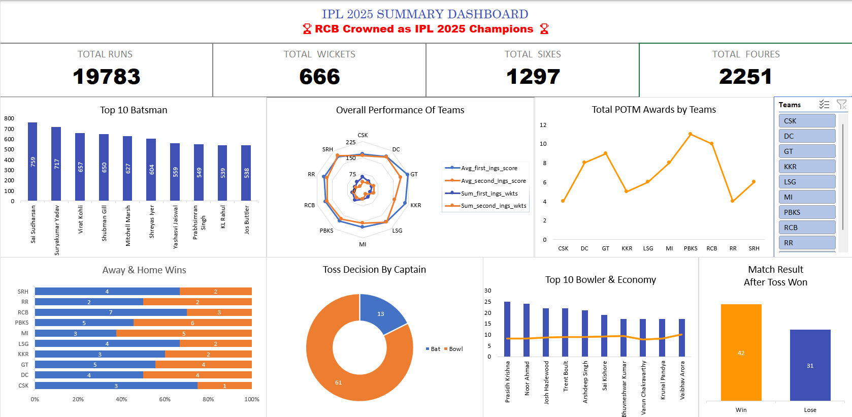
IPL 2025 Season Analysis
Tools Used: Microsoft Excel
Skills Demonstrated: Data Cleaning, Match Statistics Analysis, Team Comparison, Conditional Formatting, Dashboard Design
Project Description: This Excel project analyzed the 2025 Indian Premier League (IPL) season, focusing on team standings, match outcomes, and player performance metrics. The aim was to summarize match data into a structured format and provide quick insights through Excel formulas, conditional formatting, and basic dashboards.
Goals
- Track team performance across the season (wins, losses, NRR).
- Identify top players in batting and bowling.
- Create summary tables for match results and tournament progress.
Key Features
- Organized data into clean tables: matches, teams, players.
- Used formulas like SUMIFS, COUNTIF, VLOOKUP, IF for calculations.
- Applied conditional formatting to highlight top teams and performers.
- Structured worksheet sections for team summary, top players, and match breakdowns.
Outcome
- Delivered a clean, easy-to-use Excel workbook summarizing the entire IPL 2025 season.
- Allowed for quick insights into match results, team ranks, and standout players.
- Demonstrated your strength in using Excel for sports analytics, trend tracking, and report generation.
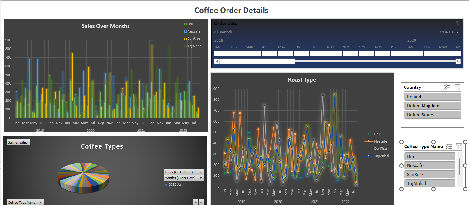
Coffee Orders Time-Series Dashboard
Tools Used: Microsoft Excel, Pivot Tables, Slicers
Skills Demonstrated: Time-Series Analysis, Dashboard Design, Interactive Filtering, Data Cleaning
Project Description: This Excel dashboard analyzes coffee order trends across multiple brands and countries over time. The aim was to create a dynamic time-series dashboard that could help stakeholders understand how different types of coffee perform monthly and regionally.
Goals
- Track monthly sales performance of coffee brands.
- Compare roast types and their popularity by country.
- Enable time-based filtering and visual storytelling in Excel.
Key Features
- Cleaned and structured raw order data for dashboard use.
- Created pivot tables to summarize sales by Brand, Roast type, Country, and Month.
- Designed interactive visuals: Bar charts, Line charts, and Pie charts.
- Added slicers to dynamically filter data by Coffee type, Country, and Time period.
Outcome
- Built a visually appealing and fully functional time-series dashboard in Excel.
- Helped uncover top-selling brands and country-specific preferences.
- Showcased your skills in building interactive Excel dashboards—perfect for business use cases in retail and product analytics.